Two companies offer exactly the same service at the same price. One looks professional, trustworthy, in control of its own business. The other looks amateurish — different colors on every social network, a website that doesn't match the business card, a tone of voice that changes with every post. In the customer's mind, that difference in perception has already decided who they'll hire before any conversation about price.
That's what strategic design solves. It isn't about having a pretty logo — it's about building a consistent perception that makes the customer trust you before they even know your product.
What strategic design is (and why it isn't "just a pretty logo")
Strategic design is the difference between "having a visual identity" and "having a visual identity that communicates something specific, to a specific audience, consistently everywhere".
A logo is one element. Branding is the complete system: a color palette with meaning, typography that reflects the brand's tone, and a visual language applied consistently across the website, social media, printed materials and customer service. When that system exists, the brand communicates professionalism before a single word is said.
Why visual identity affects the buying decision
The human brain processes images before it processes text. Before reading what your company does, the customer has already formed an unconscious opinion based on colors, typography and visual organization.
That first impression sends specific signals:
- Consistent colors signal organization and control
- Careful typography signals attention to detail
- Uniform application across every channel signals solidity — a company that "knows what it's doing"
- Visual inconsistency signals the opposite: carelessness, improvisation, risk
Nobody consciously decides "I won't buy because the colors don't match." But the feeling of distrust it creates influences the decision even when the customer doesn't know why.
The elements that make up a consistent brand identity
A complete brand identity goes far beyond the logo:
- Color palette — 2 to 4 main colors, always applied the same way
- Typography — 1 to 2 fonts, used across all materials
- Tone of voice — how the brand speaks: formal, friendly, technical, relaxed
- Grid and spacing — how elements are organized visually
- Applications — how all of this shows up on the website, social media, packaging, storefront, presentations
When these elements are defined and documented (what professionals call a brand book), anyone on the team — or any vendor — can create new materials while keeping the same identity.
What the numbers show
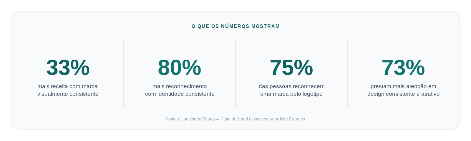
According to the State of Brand Consistency report (Lucidpress/Marq), presenting your brand consistently can increase revenue by up to 33% and improve recognition by up to 80%. Research on brand recognition shows that 75% of people recognize a brand by its logo, and an Adobe study reveals that 73% pay more attention to brands with consistent, appealing design.
These numbers confirm what is already intuitive: a brand isn't an aesthetic expense, it's an investment with measurable returns in recognition and sales.
Where inconsistency shows up most
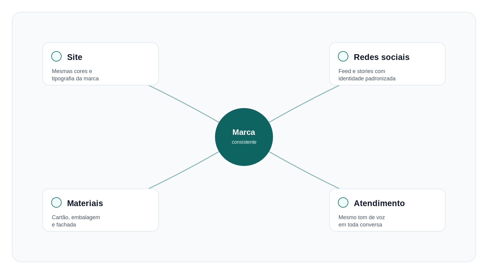
In practice, brand inconsistency shows up in predictable places:
- A website with one palette, Instagram with another — usually because they were created at different times, by different people, without a shared guide
- Business cards, storefront and packaging with old versions of the logo — the brand evolved, but not every material was updated
- A tone of voice that changes with every post — sometimes formal, sometimes relaxed, with no criteria
- Sales presentations built from scratch every time, with no consistent template
Each of these is a missed opportunity to reinforce trust — or, worse, an opportunity to create doubt.
How to build (or fix) your company's branding
1. Audit what already exists. Gather everything your brand uses today: website, social media, printed materials, presentations. Identify where colors, fonts or tone diverge.
2. Define the system, not just the logo. Colors, typography, tone of voice and usage rules should be documented — even in a simple form — so that any new material follows the same standard.
3. Update the highest-visibility touchpoints first. Your website and social media usually get the most exposure. Start with them before reviewing lower-reach materials.
4. Apply it with discipline. A brand system only works if it's followed everywhere, including the "smaller" materials — email signature, WhatsApp Business, internal presentations.
Common mistakes
- Changing visual identity too often. Every change resets the recognition that was being built.
- Handing off pieces to different people without a shared guide. Each vendor interprets the brand their own way, and the result ends up fragmented.
- Confusing "pretty" with "strategic". A design can be aesthetically pleasing and still say nothing about the business or its audience.
- Ignoring practical application. A brand book that nobody consults day to day doesn't fix any inconsistency.
Conclusion
Branding and strategic design aren't a luxury reserved for large companies — they're the difference between looking trustworthy or looking improvised to someone deciding whether to buy from you. The good news is that consistency is a choice, not a huge investment: it starts by defining the system and applying it with discipline at every touchpoint.
Companies that invest in this aren't just "getting prettier" — they're reducing the friction of trust that keeps customers from closing the deal.
If reading this article made you realize your company has different versions of its own identity scattered across its website, social media and materials, now is the time to organize that into a single system and actually apply it. [Talk to me](/contact) to structure (or rebuild) your business's branding and strategic design, or see how this has already been applied in [real projects](/projects).